Hi All,
First off, the headline new feature in terms of visualisations is Trellis Charts; these are “grids of charts” that display matrices of measures with each cell in the matrix containing a micro chart, showing for example sales in each territory and product category graphed over time. Trellis Charts are available for all installations of OBIEE 11.1.1.6.2 BP1, not just Exalytics-enabled ones, but as we’ll see in a moment they’re best suited to Exalytics environments. Simple Trellis Charts, as shown in the screenshot below, allow you to select a particular graph type for each trellis chart cell, with in the example below each cell in the trellis showing sales broken-down by product category.
Find Bellow steps:
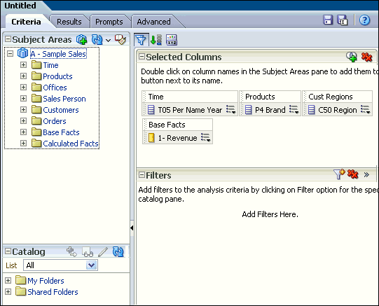
1.Create a new analysis by selecting New>Analysis on the global header, and then selecting A-Sample Sales as the subject area.
2.Select Column from criteria tab.
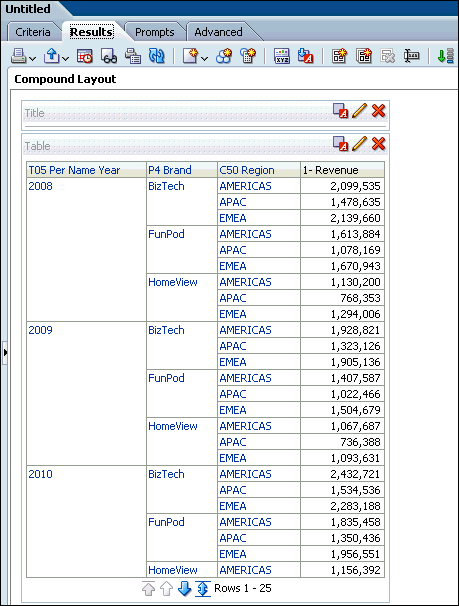
3.Click the Results tab. Two views Title and Table appear.
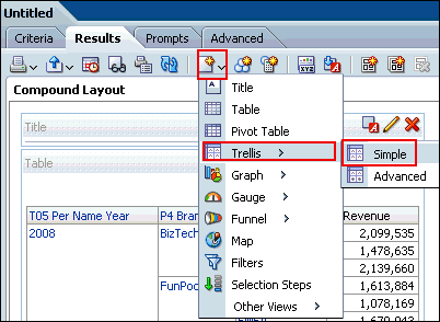
4. Add the Trellis view. Select New View>Trellis>Simple.
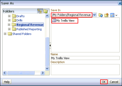
5. Save the analysis as My Trellis View, under the folder My Folders/Regional Revenue.
6.Click the Edit View pencil icon in the Trellis view at the Compound Layout. Note that the layout pane appears vertical.
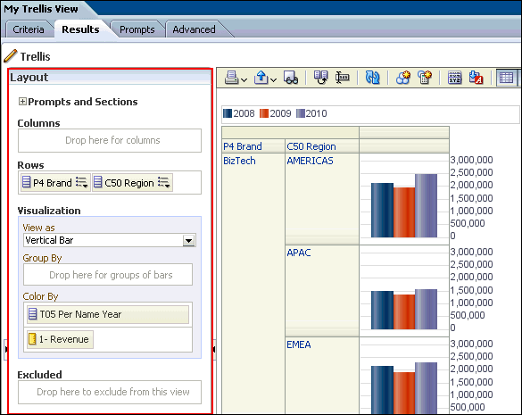
7.Arrange the dimensions and measure as shown below:
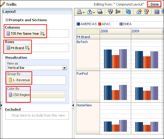
8.Click Done.
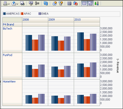
9.The Trellis view appears. Save the analysis. Observe that the measure has the same scale for all the Brands.
Finally See the result..
Thanks,
First off, the headline new feature in terms of visualisations is Trellis Charts; these are “grids of charts” that display matrices of measures with each cell in the matrix containing a micro chart, showing for example sales in each territory and product category graphed over time. Trellis Charts are available for all installations of OBIEE 11.1.1.6.2 BP1, not just Exalytics-enabled ones, but as we’ll see in a moment they’re best suited to Exalytics environments. Simple Trellis Charts, as shown in the screenshot below, allow you to select a particular graph type for each trellis chart cell, with in the example below each cell in the trellis showing sales broken-down by product category.
Find Bellow steps:
1.Create a new analysis by selecting New>Analysis on the global header, and then selecting A-Sample Sales as the subject area.
2.Select Column from criteria tab.

3.Click the Results tab. Two views Title and Table appear.

4. Add the Trellis view. Select New View>Trellis>Simple.

5. Save the analysis as My Trellis View, under the folder My Folders/Regional Revenue.

6.Click the Edit View pencil icon
 in the Trellis view at the Compound Layout. Note that the layout pane appears vertical.
7.Arrange the dimensions and measure as shown below:

8.Click Done.
9.The Trellis view appears. Save the analysis. Observe that the measure has the same scale for all the Brands.
Finally See the result..

Thanks,
No comments:
Post a Comment