Types Of Chats For Designing The Dashboard
1.Bar Charts:
Bar charts should always start with zero and show nominal
data values in comparison to each other. They can be vertical or horizontal.
Design should always try to avoid horizontal scrolling which could dictate the
orientation of the bar chart. Utilize features like section scrolling or graph
prompts to maximize dashboard real estate and offer the cleanest looking
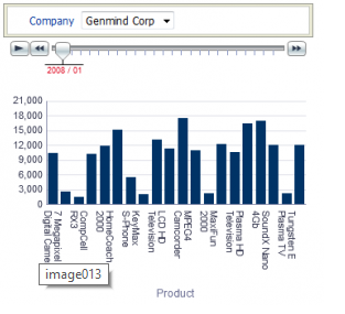
charts. The bar chart to the right starts at zero, compares products, allows
the user to section slide for month over month numbers, and allows for
prompting on the company using a graph prompt.
2.Stacked Bar Chart:
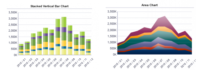
Stack bar graphs can be confusing if not used appropriately.
Stacking numbers like percentages, or loosely related dimensions can lead to
misleading results. The total is the most clearly identified number of the
display and should be the most relevant fact on display. It is best practice to
set the largest stack on the bottom as much as possible. Colors or patterns
should be easily distinguished and use a qualitative scheme. Area charts show
the stacked relationships (totals) best flowing over time.
3.Pie Charts:
Most often, pie charts are misused to communicate part-to-whole
scenarios where line or bar charts would be much more effective. They should
not be done in #D, have a limited number of slices, and be used to show
percentage of the whole. Many visualization experts dislike them as they tend
to be misused.
4.Scatter Plots and Bubble Graphs:
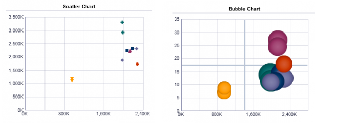
Scatter plots are great options for displaying relationships
between two quantitative variables, even with exceptionally large sets of data.
Best practices around scatter plots include removing fill color where possible,
visually identifying groups when multiple groups are plotted together (shapes,
images, shades of color), displaying trend lines and using trellis charts to
reduce complexity. Bubble charts limit the number of points that can be plotted
but allow for a 3rd metric to be compared on the same chart.
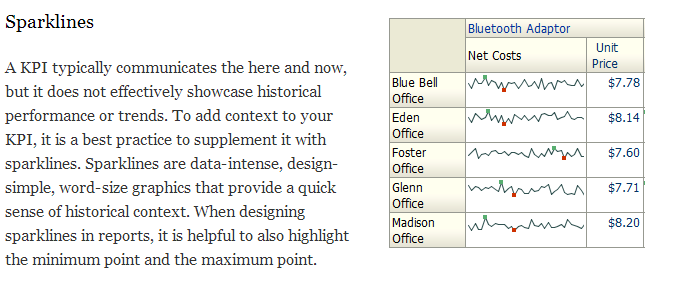
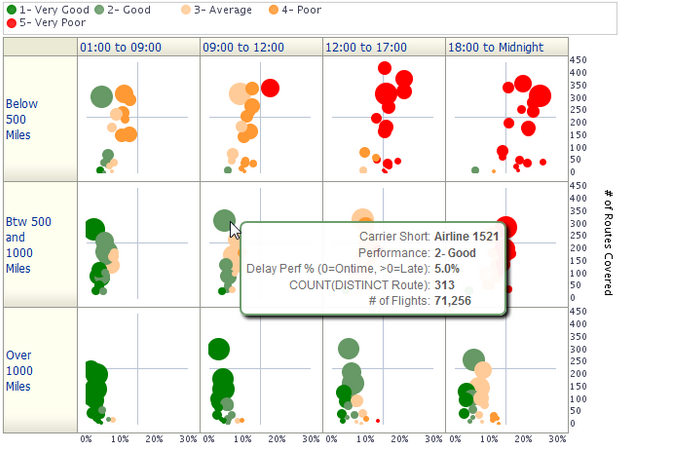
5.Trellis Charts:
Trellis charts are a small series of charts that much like
sparklines also provide a very fast visual comparison of trends over time
periods. In 11.1.1.6.4 they are available as simple or advanced trellis charts.
Think of a pivot table on steroids, where you can show charts in context of a 2
axis pivot table. It really allows for the maximization of data consumption on
one page. In the example below the columns represent time periods during the day,
the rows represent the flights distance in 3 buckets, and the bubble chart
shows 4 different metrics in each in cell. The color represents performance
rating, the vertical axis shows the number of routes, the horizontal axis shows
the % late, and the bubble size is the number of flights. It paints a picture
of shorts routes having more flights and diminishing performance as the day
progresses.
No comments:
Post a Comment